 Every detail matters – menu typefaces affect customer sales

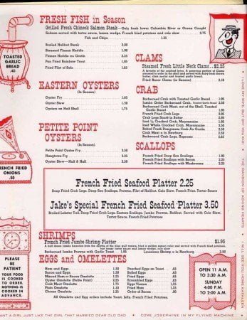
I’ve reported on the latest ideas in menu design before, but but last week I stumbled across this article on menu typefaces in Time Magazine from 2008, but still think it is valid and interesting. Research shows that not only layout, but menu fonts can impact customer buying decisions.
People infer that if something on a menu is difficult to understand or hard to read that it takes great skill and effort to prepare,” says Song, a Ph.D. candidate in psychology at the University of Michigan. “When I go to an expensive French restaurant, I can hardly pronounce the words on the menu, so I take for granted that it’s expensive because it’s not comprehensible.”
Similarly, Song says, using an offbeat typeface to obscure a dish’s description may signal hidden value to an unsuspecting diner on unfamiliar ground. That may explain the implicit logic employed by restaurants offering exorbitant entrees described with elaborately scripted fonts in microscopic print.
To conduct one of her experiments, Song compared the responses of subjects exposed to menu descriptions typed in a simple Arial font with responses from those exposed to identical dish descriptions in a harder-to-read Mistral font. Subjects in the latter group were more likely to conclude that the dish was hard to prepare and required great skill….To conduct one of her experiments, Song compared the responses of subjects exposed to menu descriptions typed in a simple Arial font with responses from those exposed to identical dish descriptions in a harder-to-read Mistral font. Subjects in the latter group were more likely to conclude that the dish was hard to prepare and required great skill.
… Song says that based on her findings, she might recommend that if restaurant owners want to give consumers the impression that their food is complex and of special value, they should consider styling their menus accordingly.
MrDonutsu says
I guess the same applies to Hip Hop: http://en.wikipedia.org/wiki/Mistral_(typeface)
Food Dude says
Hey! I’m about to roll out a whole new version of this site, all in Comic Sans and Mistral!
shawn says
They should try Comic Sans. Or Papyrus. Those fonts would rally make a menu….special.
JDG says
Dammit, you beat me to the punch on the Comic Sans bashing. I was going to say that a menu printed in Comic Sans would make me find another place to eat.
DinahDavis says
If I see Papyrus used on one more sign, I’m going to go postal. Enough already!
Comic Sans is a whole other rant–best take on Comic Sans EVER:
http://www.mcsweeneys.net/links/monologues/15comicsans.html
onetart says
Here’s a good post about comic sans on passiveaggressivenotes.com
http://www.passiveaggressivenotes.com/2010/07/19/the-53rd-annual-punctuation-posse-round-up/
second bit down
nate says
I dunno if I would think a menu in Mistral was describing dishes that were hard to prepare or take great skill. However, a menu in Arial might make me think the food was bland and uninspired. Then again, Tanuki has by far the worst-looking and hardest to read menu (with super-generic font) I’ve ever seen anywhere and I love the food.